Learn Smarter. Code Better. Grow Faster.
Take on real coding challenges, sharpen your logic, and build the skills to level up — one solution at a time.

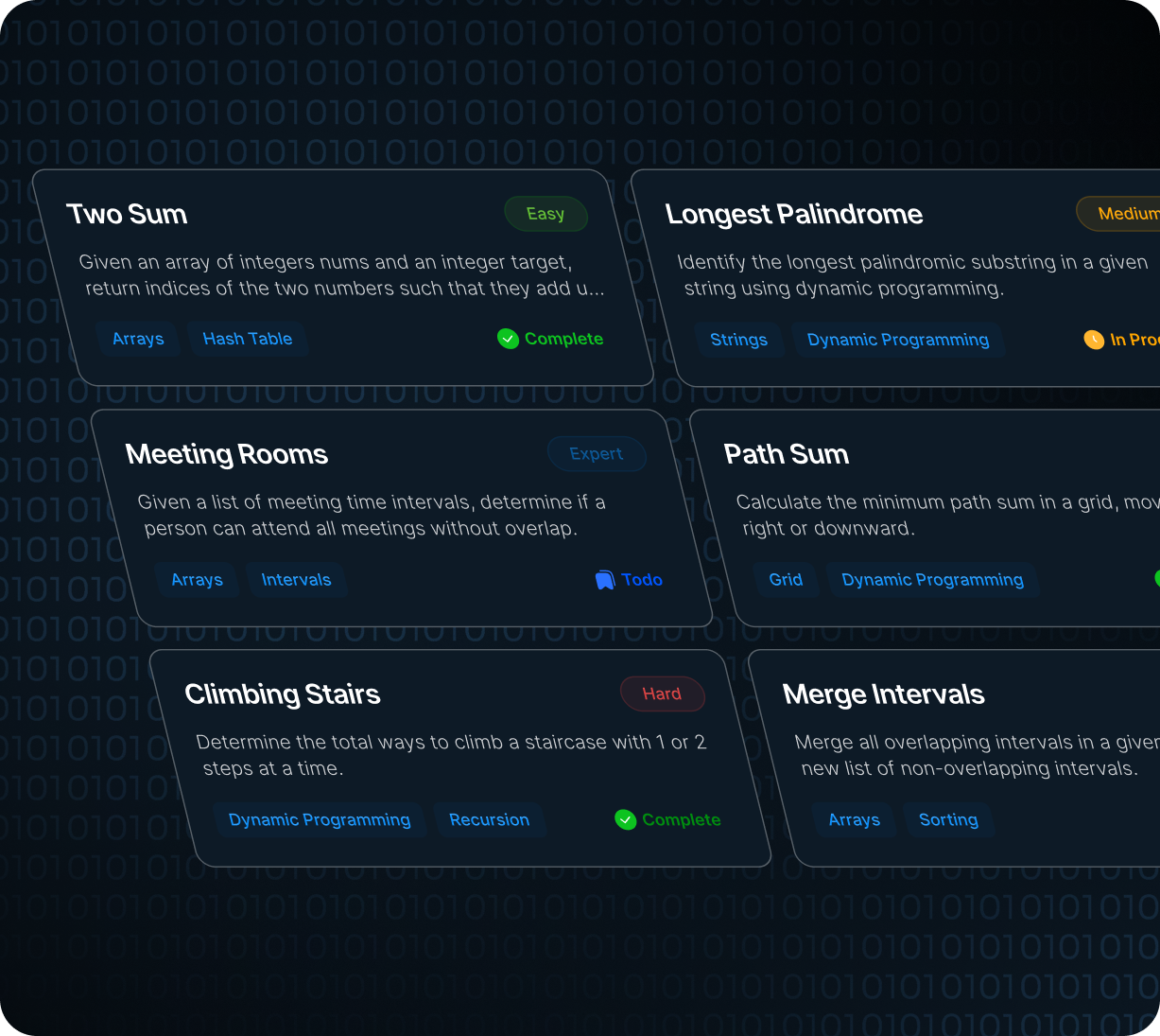
Practical Coding Made Simple!

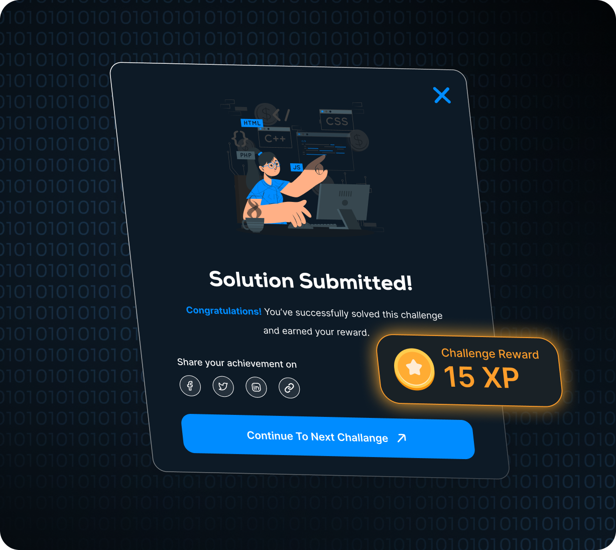
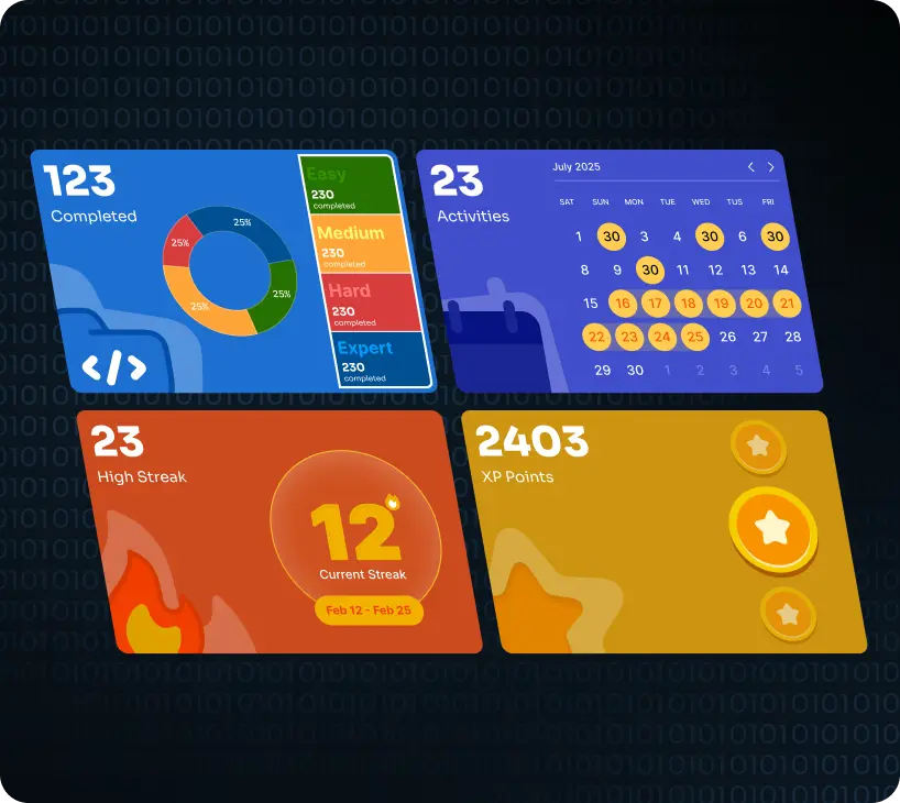
Motivation Through Progress & Community!

Personalized Learning That Grows With You!

Real-World Preparation forCareer Success!
Take on real coding challenges, sharpen your logic, and build the skills to level up — one solution at a time.


{{ C++ }}
Connect, collaborate, and level up with like-minded coders.

Jan 4 2023 • Doc Ricardo
Really impressed with how simple and intuitive everything feels. I didn’t have to read a single help doc to understand what to do next. It feels like the product has been designed around how I naturally think.

Jan 6 2023 • Doc Ricardo
The onboarding flow was super smooth and easy to follow. Each step felt intentional, with just enough context to keep me confident. I was able to go from signup to first success in just a few minutes.

Jan 8 2023 • Doc Ricardo
Clean UI, great performance, and thoughtful small details everywhere. You can tell a lot of care went into the microcopy and layout decisions. Nothing feels cluttered or unnecessary on the screen.

Jan 10 2023 • Doc Ricardo
I love how everything feels fast and responsive even on low-end devices. Even with multiple tabs open, the experience stayed smooth. This makes it something I can rely on day-to-day without frustration.

Jan 12 2023 • Doc Ricardo
Exactly the kind of product experience I wish more apps had. It feels professional without being cold, and polished without being overdesigned. I’m genuinely excited to keep using it.

Jan 14 2023 • Doc Ricardo
The flow is clear, the copy is friendly, and nothing feels confusing. Even when I tried something new, the interface gently guided me in the right direction. It’s a great balance of power and simplicity.

Jan 16 2023 • Doc Ricardo
Really happy with how quickly I could get from signup to value. There’s no unnecessary friction or long setup steps. It just lets you get to work and see results fast.

Jan 18 2023 • Doc Ricardo
Animations feel subtle but add a nice touch of polish to the UI. Nothing is too flashy or distracting, but everything feels alive. It makes the experience feel premium without slowing it down.

Jan 20 2023 • Doc Ricardo
Everything feels modern without being overcomplicated. I never feel like I’m hunting for basic actions. The most important things are always right where I expect them to be.

Jan 22 2023 • Doc Ricardo
The layout adapts perfectly on mobile and desktop. I can switch between devices without losing my sense of where things are. It’s clearly been designed with responsiveness in mind from day one.

Jan 24 2023 • Doc Ricardo
The attention to spacing, typography and hierarchy really shows. Every section breathes, and my eyes naturally move to the right place. It feels like a design system, not a random collection of screens.

Jan 26 2023 • Doc Ricardo
I like how every section has a clear purpose and call to action. There are no dead ends or confusing states. It always feels like the product is gently nudging me toward the next meaningful step.

Jan 28 2023 • Doc Ricardo
Dark mode looks clean and balanced, nothing feels too noisy or low-contrast. Colors are chosen carefully so content still feels readable and sharp. It’s something I actually enjoy staring at for hours.

Jan 30 2023 • Doc Ricardo
It feels like something built by people who actually care about UX. From the smallest icons to the biggest headers, everything feels consistent. You don’t see this level of detail in most tools.

Feb 1 2023 • Doc Ricardo
Small microinteractions make the experience feel premium. Hover states, transitions and feedback all feel purposeful. It’s the kind of polish that makes you want to keep exploring the product.
Jan 4 2023 • Doc Ricardo
Really impressed with how simple and intuitive everything feels. I didn’t have to read a single help doc to understand what to do next. It feels like the product has been designed around how I naturally think.
Jan 6 2023 • Doc Ricardo
The onboarding flow was super smooth and easy to follow. Each step felt intentional, with just enough context to keep me confident. I was able to go from signup to first success in just a few minutes.
Jan 8 2023 • Doc Ricardo
Clean UI, great performance, and thoughtful small details everywhere. You can tell a lot of care went into the microcopy and layout decisions. Nothing feels cluttered or unnecessary on the screen.
Jan 10 2023 • Doc Ricardo
I love how everything feels fast and responsive even on low-end devices. Even with multiple tabs open, the experience stayed smooth. This makes it something I can rely on day-to-day without frustration.
Jan 12 2023 • Doc Ricardo
Exactly the kind of product experience I wish more apps had. It feels professional without being cold, and polished without being overdesigned. I’m genuinely excited to keep using it.
Jan 14 2023 • Doc Ricardo
The flow is clear, the copy is friendly, and nothing feels confusing. Even when I tried something new, the interface gently guided me in the right direction. It’s a great balance of power and simplicity.
Jan 16 2023 • Doc Ricardo
Really happy with how quickly I could get from signup to value. There’s no unnecessary friction or long setup steps. It just lets you get to work and see results fast.
Jan 18 2023 • Doc Ricardo
Animations feel subtle but add a nice touch of polish to the UI. Nothing is too flashy or distracting, but everything feels alive. It makes the experience feel premium without slowing it down.
Jan 20 2023 • Doc Ricardo
Everything feels modern without being overcomplicated. I never feel like I’m hunting for basic actions. The most important things are always right where I expect them to be.
Jan 22 2023 • Doc Ricardo
The layout adapts perfectly on mobile and desktop. I can switch between devices without losing my sense of where things are. It’s clearly been designed with responsiveness in mind from day one.
Jan 24 2023 • Doc Ricardo
The attention to spacing, typography and hierarchy really shows. Every section breathes, and my eyes naturally move to the right place. It feels like a design system, not a random collection of screens.
Jan 26 2023 • Doc Ricardo
I like how every section has a clear purpose and call to action. There are no dead ends or confusing states. It always feels like the product is gently nudging me toward the next meaningful step.
Jan 28 2023 • Doc Ricardo
Dark mode looks clean and balanced, nothing feels too noisy or low-contrast. Colors are chosen carefully so content still feels readable and sharp. It’s something I actually enjoy staring at for hours.
Jan 30 2023 • Doc Ricardo
It feels like something built by people who actually care about UX. From the smallest icons to the biggest headers, everything feels consistent. You don’t see this level of detail in most tools.
Feb 1 2023 • Doc Ricardo
Small microinteractions make the experience feel premium. Hover states, transitions and feedback all feel purposeful. It’s the kind of polish that makes you want to keep exploring the product.

Feb 3 2023 • Doc Ricardo
The copy is clear, friendly, and helps me understand each step. I never feel like I’m reading corporate jargon or filler text. It really feels like the product is talking to me, not at me.

Feb 5 2023 • Doc Ricardo
Super impressed with how fast everything loads and responds. Even complex actions feel almost instant. That kind of speed makes it easy to stay focused and get things done.

Feb 7 2023 • Doc Ricardo
I like how the layout guides my eye without feeling forced. Primary actions are always prioritized but never aggressive. It feels like the interface quietly supports me instead of shouting for attention.

Feb 9 2023 • Doc Ricardo
The design feels consistent across all sections and components. Buttons, cards, headings and inputs all follow the same visual language. It creates a sense of trust and reliability as I use it.

Feb 11 2023 • Doc Ricardo
The color palette is modern and easy on the eyes. Nothing feels too saturated or washed out. It’s the kind of interface I don’t mind working in for long stretches of time.

Feb 13 2023 • Doc Ricardo
I didn’t have to think much—things just worked how I expected. That kind of invisible UX is rare. It feels like they’ve removed all the friction I’m used to from other tools.

Feb 15 2023 • Doc Ricardo
The structure is clear; I always know where I am and what’s next. Navigation is obvious without being overly labeled. It makes the whole experience feel calm and predictable in a good way.

Feb 17 2023 • Doc Ricardo
Feels like a polished product, not a rough MVP. Nothing feels half-baked or temporary. It genuinely feels ready for real-world teams and real workflows.

Feb 19 2023 • Doc Ricardo
Really like the way cards and sections are spaced and grouped. Related information is always kept together, which makes scanning super fast. It’s easy to get a high-level view without losing details.

Feb 21 2023 • Doc Ricardo
Nothing feels overwhelming, even though there’s a lot of content. The hierarchy and spacing make the interface feel light. It’s rare to see dense features presented in such a relaxed way.

Feb 23 2023 • Doc Ricardo
The typography choices make everything very readable. Font sizes, weights and line heights feel carefully tuned. Even in longer sections of text, my eyes don’t get tired.

Feb 25 2023 • Doc Ricardo
Interactions feel smooth and natural, with no janky transitions. Buttons respond instantly and feedback feels snappy. It adds up to an experience that feels considered and well engineered.

Feb 27 2023 • Doc Ricardo
It gives a very professional and trustworthy first impression. From the hero section to the final CTA, it feels like it belongs in a serious production environment. I’d be comfortable sharing it with clients.

Mar 1 2023 • Doc Ricardo
Love how the layout still feels balanced on ultra-wide screens. Many products forget about larger displays, but this one doesn’t. Nothing stretches awkwardly or leaves massive empty spaces.

Mar 3 2023 • Doc Ricardo
Feels like a lot of thought went into every layout decision. Each component has a clear purpose and place. It’s the kind of UI that makes you want to explore just to see what else is there.
Feb 3 2023 • Doc Ricardo
The copy is clear, friendly, and helps me understand each step. I never feel like I’m reading corporate jargon or filler text. It really feels like the product is talking to me, not at me.
Feb 5 2023 • Doc Ricardo
Super impressed with how fast everything loads and responds. Even complex actions feel almost instant. That kind of speed makes it easy to stay focused and get things done.
Feb 7 2023 • Doc Ricardo
I like how the layout guides my eye without feeling forced. Primary actions are always prioritized but never aggressive. It feels like the interface quietly supports me instead of shouting for attention.
Feb 9 2023 • Doc Ricardo
The design feels consistent across all sections and components. Buttons, cards, headings and inputs all follow the same visual language. It creates a sense of trust and reliability as I use it.
Feb 11 2023 • Doc Ricardo
The color palette is modern and easy on the eyes. Nothing feels too saturated or washed out. It’s the kind of interface I don’t mind working in for long stretches of time.
Feb 13 2023 • Doc Ricardo
I didn’t have to think much—things just worked how I expected. That kind of invisible UX is rare. It feels like they’ve removed all the friction I’m used to from other tools.
Feb 15 2023 • Doc Ricardo
The structure is clear; I always know where I am and what’s next. Navigation is obvious without being overly labeled. It makes the whole experience feel calm and predictable in a good way.
Feb 17 2023 • Doc Ricardo
Feels like a polished product, not a rough MVP. Nothing feels half-baked or temporary. It genuinely feels ready for real-world teams and real workflows.
Feb 19 2023 • Doc Ricardo
Really like the way cards and sections are spaced and grouped. Related information is always kept together, which makes scanning super fast. It’s easy to get a high-level view without losing details.
Feb 21 2023 • Doc Ricardo
Nothing feels overwhelming, even though there’s a lot of content. The hierarchy and spacing make the interface feel light. It’s rare to see dense features presented in such a relaxed way.
Feb 23 2023 • Doc Ricardo
The typography choices make everything very readable. Font sizes, weights and line heights feel carefully tuned. Even in longer sections of text, my eyes don’t get tired.
Feb 25 2023 • Doc Ricardo
Interactions feel smooth and natural, with no janky transitions. Buttons respond instantly and feedback feels snappy. It adds up to an experience that feels considered and well engineered.
Feb 27 2023 • Doc Ricardo
It gives a very professional and trustworthy first impression. From the hero section to the final CTA, it feels like it belongs in a serious production environment. I’d be comfortable sharing it with clients.
Mar 1 2023 • Doc Ricardo
Love how the layout still feels balanced on ultra-wide screens. Many products forget about larger displays, but this one doesn’t. Nothing stretches awkwardly or leaves massive empty spaces.
Mar 3 2023 • Doc Ricardo
Feels like a lot of thought went into every layout decision. Each component has a clear purpose and place. It’s the kind of UI that makes you want to explore just to see what else is there.

Mar 5 2023 • Doc Ricardo
The experience is smooth from hero section to the very bottom. There are no awkward jumps or sudden style changes. It feels like one continuous, well-crafted narrative.

Mar 7 2023 • Doc Ricardo
I love how clearly the benefits are communicated on each section. There’s no guessing what I’m supposed to get out of a feature. The messaging is tight, focused and easy to remember.

Mar 9 2023 • Doc Ricardo
Everything feels cohesive, like one system instead of random parts. Patterns repeat in a way that feels intentional. After a while, I just instinctively know how new things will work.

Mar 11 2023 • Doc Ricardo
The layout never feels cramped, even on smaller screens. Elements resize intelligently instead of just shrinking. It makes the mobile experience feel just as premium as desktop.

Mar 13 2023 • Doc Ricardo
I like the balance between visuals and text, nothing feels heavy. Icons and illustrations support the content instead of replacing it. It’s a nice mix of form and function.

Mar 15 2023 • Doc Ricardo
Navigation is straightforward; I never feel lost or stuck. I can always see where I came from and where I can go next. That sense of orientation makes long sessions feel effortless.

Mar 17 2023 • Doc Ricardo
The design feels premium but still very approachable. It’s polished enough for enterprise but friendly enough for small teams. That’s a rare balance to get right.

Mar 19 2023 • Doc Ricardo
Really appreciate the small microcopy hints in the UI. Tooltips and helper text show up exactly when I need them. It feels like there’s a quiet guide built into the experience.

Mar 21 2023 • Doc Ricardo
Hero, features, and reviews all flow together really nicely. The story feels consistent as I scroll. By the time I reach the bottom, I clearly understand what the product offers.

Mar 23 2023 • Doc Ricardo
The responsive behavior is smooth; no weird jumps or broken layouts. Components gracefully resize and reflow. It feels like the product was built mobile-first and then enhanced for larger screens.

Mar 25 2023 • Doc Ricardo
Overall it just feels like a very well-thought-out product. There’s a visible design system behind everything. That level of structure makes me confident it will scale as more features are added.

Mar 27 2023 • Doc Ricardo
Every section feels intentional and not just thrown in. There’s a clear reason for every block of content. Nothing feels like filler or something that was added just to look busy.

Mar 29 2023 • Doc Ricardo
I like that the design feels fresh but not distracting. It has its own personality without getting in the way of the work. It’s the kind of UI that ages well over time.

Mar 31 2023 • Doc Ricardo
Flows well from top to bottom, with a clear story. Each section builds on the one before it. By the end, you feel informed and ready to take action without any confusion.

Apr 2 2023 • Doc Ricardo
If this is the beta, I’m excited to see where it goes next. The foundation already feels solid and thoughtful. I can easily imagine more advanced features fitting right into this design system.
Mar 5 2023 • Doc Ricardo
The experience is smooth from hero section to the very bottom. There are no awkward jumps or sudden style changes. It feels like one continuous, well-crafted narrative.
Mar 7 2023 • Doc Ricardo
I love how clearly the benefits are communicated on each section. There’s no guessing what I’m supposed to get out of a feature. The messaging is tight, focused and easy to remember.
Mar 9 2023 • Doc Ricardo
Everything feels cohesive, like one system instead of random parts. Patterns repeat in a way that feels intentional. After a while, I just instinctively know how new things will work.
Mar 11 2023 • Doc Ricardo
The layout never feels cramped, even on smaller screens. Elements resize intelligently instead of just shrinking. It makes the mobile experience feel just as premium as desktop.
Mar 13 2023 • Doc Ricardo
I like the balance between visuals and text, nothing feels heavy. Icons and illustrations support the content instead of replacing it. It’s a nice mix of form and function.
Mar 15 2023 • Doc Ricardo
Navigation is straightforward; I never feel lost or stuck. I can always see where I came from and where I can go next. That sense of orientation makes long sessions feel effortless.
Mar 17 2023 • Doc Ricardo
The design feels premium but still very approachable. It’s polished enough for enterprise but friendly enough for small teams. That’s a rare balance to get right.
Mar 19 2023 • Doc Ricardo
Really appreciate the small microcopy hints in the UI. Tooltips and helper text show up exactly when I need them. It feels like there’s a quiet guide built into the experience.
Mar 21 2023 • Doc Ricardo
Hero, features, and reviews all flow together really nicely. The story feels consistent as I scroll. By the time I reach the bottom, I clearly understand what the product offers.
Mar 23 2023 • Doc Ricardo
The responsive behavior is smooth; no weird jumps or broken layouts. Components gracefully resize and reflow. It feels like the product was built mobile-first and then enhanced for larger screens.
Mar 25 2023 • Doc Ricardo
Overall it just feels like a very well-thought-out product. There’s a visible design system behind everything. That level of structure makes me confident it will scale as more features are added.
Mar 27 2023 • Doc Ricardo
Every section feels intentional and not just thrown in. There’s a clear reason for every block of content. Nothing feels like filler or something that was added just to look busy.
Mar 29 2023 • Doc Ricardo
I like that the design feels fresh but not distracting. It has its own personality without getting in the way of the work. It’s the kind of UI that ages well over time.
Mar 31 2023 • Doc Ricardo
Flows well from top to bottom, with a clear story. Each section builds on the one before it. By the end, you feel informed and ready to take action without any confusion.
Apr 2 2023 • Doc Ricardo
If this is the beta, I’m excited to see where it goes next. The foundation already feels solid and thoughtful. I can easily imagine more advanced features fitting right into this design system.
+3 million users enjoy Funcstres
|